The Brush Flo | Miniature Painting Portfolio & Commissions
Miniature Painter & Warpstone digger
Portfolio of my miniature painting projects
Paintings
Here you'll find the latest projects I'm working on
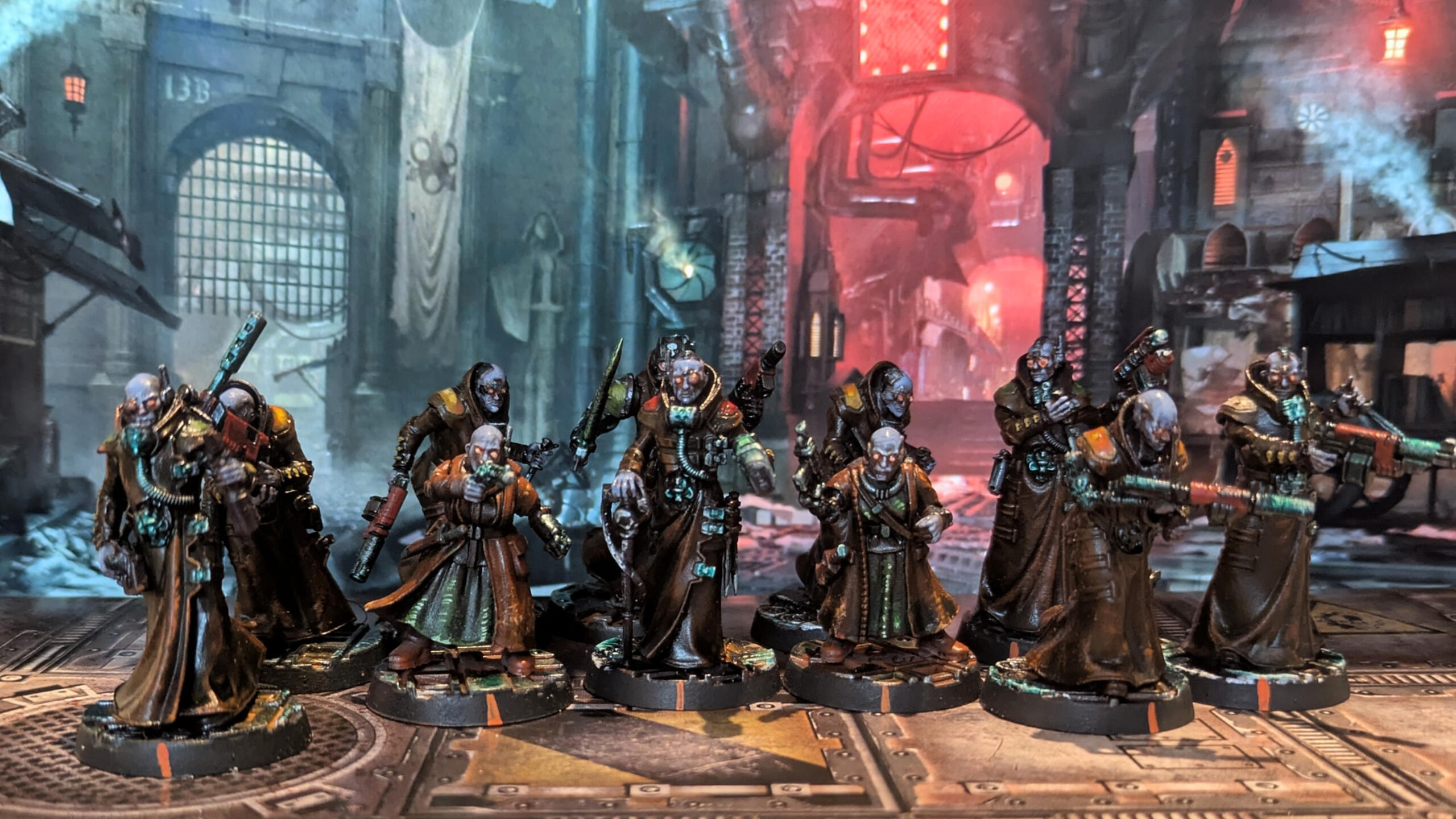
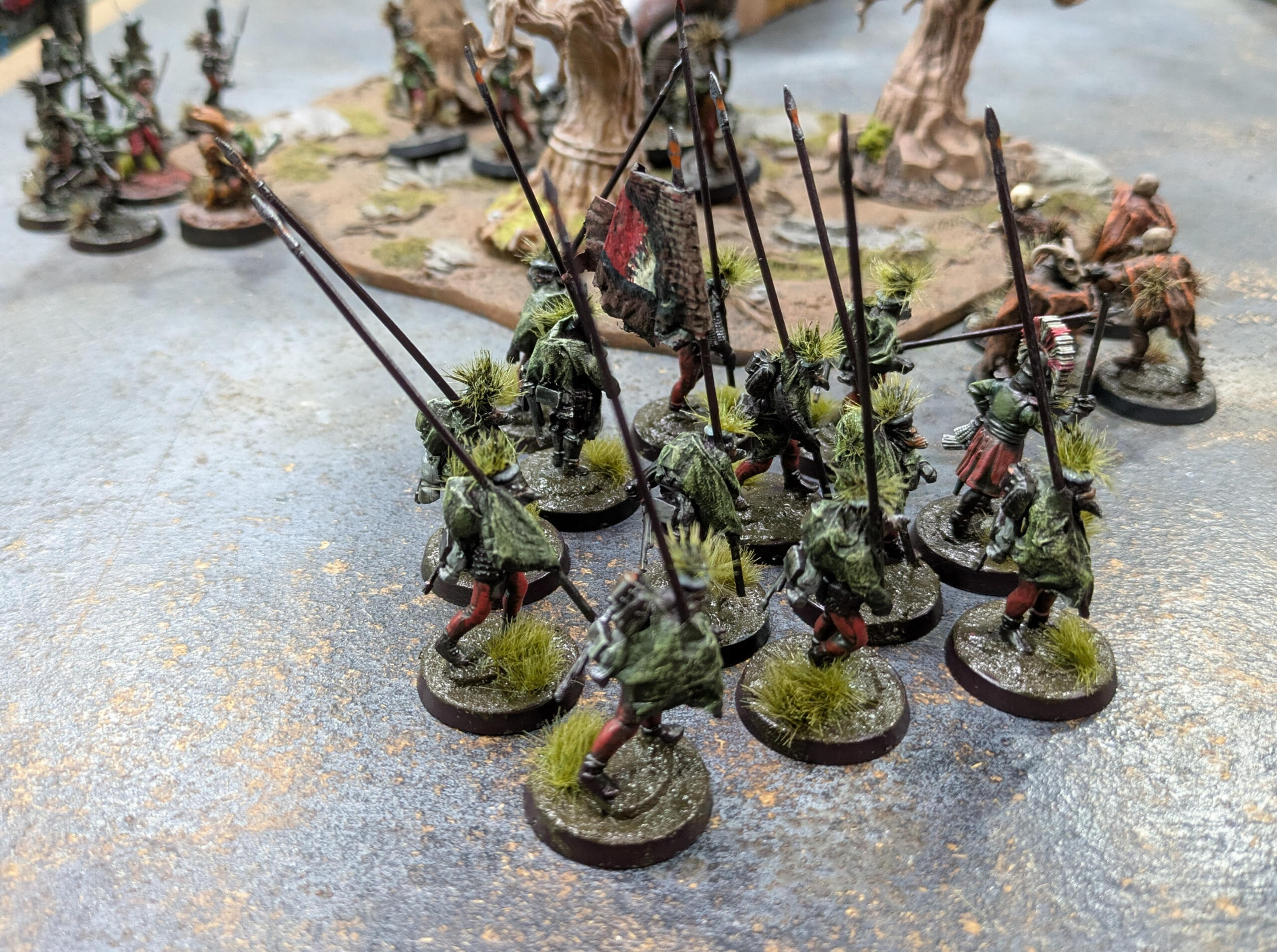
The Skaven of Shadow: When Orange Becomes Rust and Blood
There’s something deeply satisfying about painting Skaven. Maybe it’s because they’re ugly, vicious, and unpretentious—a lot like my first attempts at painting them ten years ago. Back then, I slapped paint on them without really understanding colors or techniques. Today, I approach them differently: with an orange base layer, aggressive brushstrokes for the reds and greens, and rusted metals applied with a sponge. The result? An army that looks like it crawled straight out of the sewers of Skavenblight, covered in rust, dried blood, and that unnatural greenish glow so characteristic of things that shouldn’t exist.---The Orange Base: The Foundation of EverythingIt all started with a bright orange base layer. Not because I wanted to keep it orange, but because it’s a warm, vibrant color that allows me to build deep reds and toxic greens on top without losing intensity.- Why orange? Because it pops under the subsequent layers. When you overlay red or green on top, the orange gives a warm depth that simulates dirt, rust, or even the sickly skin of Skaven.
- Application: A uniform layer, without worrying about precision. The idea is for it to serve as a background for everything else.---Red and Green: Brushstrokes Like ScarsOnce the orange base was dry, I built up the reds and greens with quick, jagged brushstrokes—almost like scratches. No smooth gradients, no perfect transitions. Just raw lines following the muscles, fabric folds, and edges of the armor.- The red: A blood-like red, almost black in places, applied in thin layers to let the orange show through. This gives the impression of irritated skin, as if the Skaven were covered in wounds and battle scars.
- Tip: I used horizontal strokes on flat areas (like cloaks) and vertical strokes on muscles to emphasize volume.- The green: A desaturated, sickly green, applied in the same way. On the priest’s cloak, for example, I pushed the green until it became almost translucent, like a toxic mist clinging to the fabric.
- Effect: By desaturating the green and layering it over the orange, I achieved a diseased hue, as if the cloak were soaked in Skaven poison.---Metals: Rust and SpongeFor the metallic parts (armor, weapons, studs), I kept the orange base and worked on top with mixtures of brown, black, and metallic applied with a sponge.- Technique:
1. A layer of rusty brown (like Vallejo Beasty Brown or Rhinox Hide) dabbed on with a sponge to create uneven patches.
2. A light drybrush of metallic (like Leadbelcher or tarnished silver) on the edges to simulate wear.
3. A wash of black or diluted green (like Athonian Camoshade) to darken the recesses and give an effect of corroded metal.- Result: The armor and weapons look ancient and poorly maintained, as if they’ve been lying in mud and rust for centuries.---The Bases: A Hostile ForestTo anchor these Skaven in their world, I opted for dark, wooded bases:
- A flock base to represent moss and dead leaves.
- Branches and roots made from wire or plastic, painted in dark brown and green.
- A green-brown wash to unify everything and give an impression of dampness and decay.The idea was to create a contrast between the Skaven’s bright colors and the dark green of the forest, as if they were emerging from a cursed swamp.---


Why It WorksThis scheme isn’t complicated, but it’s effective:
- The orange provides a bright foundation that makes the other colors stand out.
- The brushstrokes on the red and green create movement and texture, as if the Skaven are in perpetual motion.
- The rusted metals add gritty realism, perfect for an army of rats.
- The bases tell a story: these Skaven aren’t just placed on a table—they come from somewhere—a dark, damp, and hostile place.---Evolution… or NotTen years ago, my Skaven looked like poorly placed splotches of color. Today, they have character, texture, and a strong visual identity—while still being quick to paint. I didn’t revolutionize my technique; I just refined it: less time spent chasing perfection, more time playing with contrasts and effects.And that’s the beauty of Skaven: even when poorly painted, they remain magnificent… because they’re supposed to be.


Rohan on the Table: A Quick Ride Through Paint and Experimentation
I painted this Rohan army a while back, during one of those periods where you just want to try something new without overthinking it. No grand masterplan, no meticulous color theory—just a few ideas, some brushes, and a desire to see these riders come to life.---Green and Yellow: A Happy AccidentI started with the classic Rohan green. It’s a safe choice, but I wanted a bit more energy. So, I grabbed an acid yellow for the highlights, almost on a whim. The contrast was way stronger than I expected—almost jarring at first. But then, it kind of worked. The green kept that earthy, Rohirrim feel, while the yellow made the miniatures pop, like sunlight breaking through storm clouds. To tie it all together, I slopped on a green glaze over everything. It softened the clash just enough, making the colors feel intentional rather than chaotic.---Leather, Cloaks, and Quick BrushstrokesI didn’t want to spend hours blending. Instead, I used quick, directional brushstrokes to suggest the texture of leather and the folds of cloaks. It’s not perfect, but it gives the impression of movement and wear—like these guys have been riding hard for days. The leather straps and boots got a similar treatment: a base of brown, a few highlights, and some streaks to mimic scuffs and creases. Nothing fancy, just enough to make it look lived-in.---
Horses: Sponge and SpeedFor the horses, I didn’t want to get bogged down in details. A sponge became my best friend. Dabbing on layers of paint created a rough, fur-like texture without the fuss. It’s not hyper-realistic, but it gets the job done and keeps the focus on the energy of the models.---Bases: Dirt, Herbs, and a Bit of LuckThe bases were an afterthought, really. I slapped on some brown paint, sprinkled dry herbs for texture, and then came the fun part: a rust-orange pigment wash mixed with alcohol. I wasn’t sure how it would turn out, but it settled into the cracks and created this dusty, weathered look—like the riders had just galloped through the plains of Rohan. It’s simple, but it ties the whole army together and gives them a sense of place.---No Pressure, Just PaintingThis project wasn’t about perfection. It was about playing with colors and techniques, seeing what worked and what didn’t. Some parts turned out better than others, but that’s part of the fun. The goal was to create an army that felt right on the table, one that captured the spirit of Rohan without getting lost in the details.---


Why It Worked (For Me, At Least)Sometimes, the best projects are the ones where you let go of expectations. This army isn’t flawless, but it’s full of character. The bold colors, the rough textures, the quick-and-dirty bases—they all add up to something that feels alive.If you’re thinking about painting your own Rohan force, my advice is simple: don’t stress. Try something new, embrace the mistakes, and enjoy the process. After all, the Riders of Rohan weren’t about perfection—they were about speed, courage, and a little bit of recklessness.
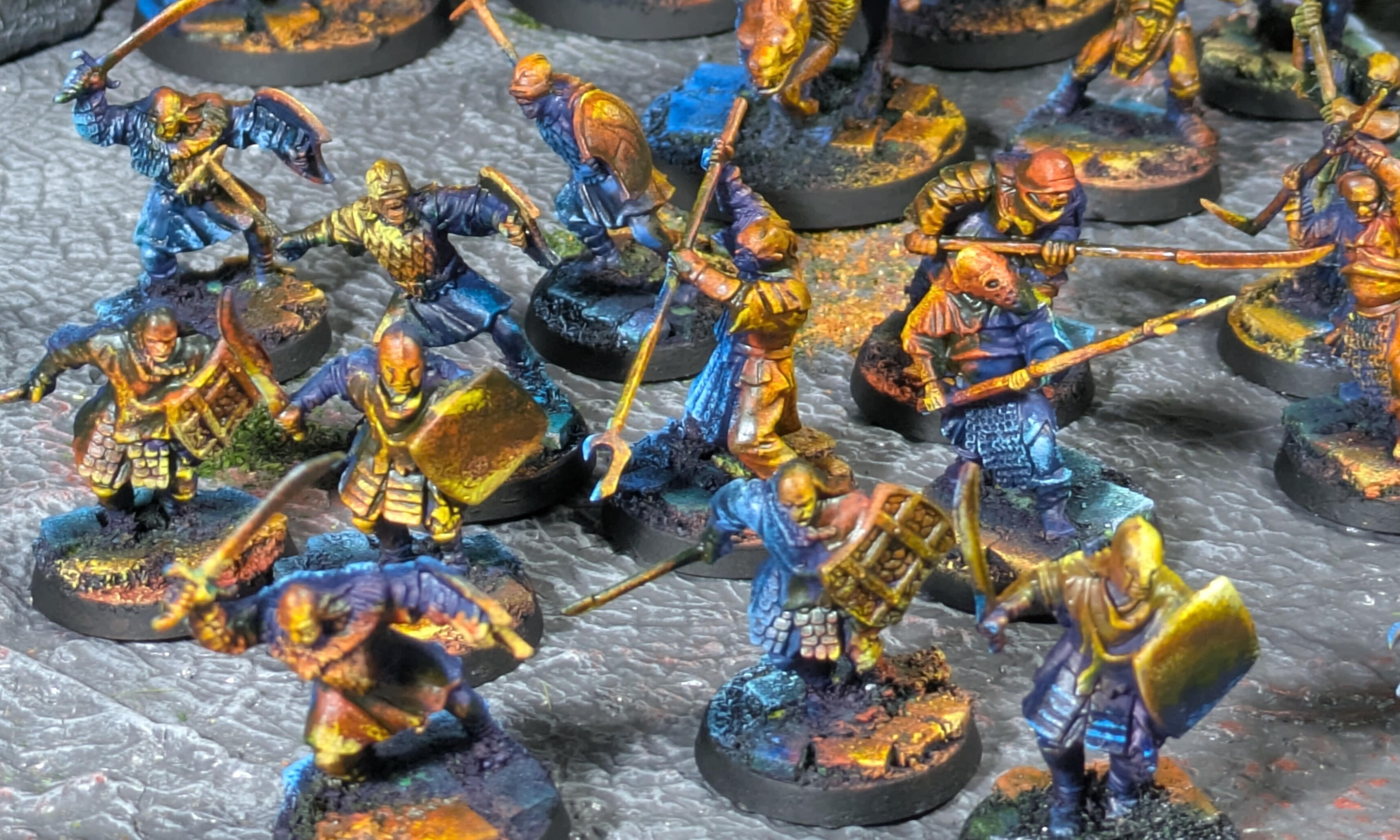
Army of the great eye
There is something fascinating about an army that seems to have emerged straight from the darkness of Middle-earth. An army that doesn’t just represent warriors, but embodies fear, destruction, and the malevolent power of Sauron. Today, I present my Mordor army for The Lord of the Rings Strategy Battle Game, a collection of miniatures painted with a radical artistic approach: bichromy and Object Source Lighting (OSL). No endless gradients, no hyper-realistic textures. Just striking contrasts, plays of light, and an atmosphere that chills you to the bone.Bichromy: The Elegance of SimplicityI chose to work with a bichrome color scheme for this army. Why? Because Mordor doesn’t need a thousand colors to make an impression. A limited palette is enough to leave a mark. Here, deep black and spectral green dominate, evoking the shadows of Minas Morgul and the evil glow of the Eye of Sauron. For the warriors and riders, I opted for golden and copper tones, reminiscent of the flames of pillaging, as if each soldier carries the mark of destruction within them.Bichromy creates immediate visual cohesion. Each miniature, from the simple orc to the dreaded Witch-king of Angmar, seems to be part of a whole. No distractions, no overload: just the essential. The colors are applied in flat areas, then enhanced with washes and sponge techniques to add depth without falling into excessive realism.OSL: Bringing Light to LifeObject Source Lighting (OSL) is the heart of this army. I wanted each miniature to tell a story through light:
- The green glow of Minas Morgul, as if the Eye of Sauron watches over its servants.
- The orange flames of pillaging, as if every sword and armor reflects burning villages.Take the Witch-king of Angmar, for example. His steed seems bathed in a greenish light, as if emerging from the toxic mists of the Morgul Vale. The reflections on his armor and cloak are not random: they guide the eye and create a dramatic atmosphere. The same goes for the foot soldiers: their shields and weapons bear the marks of the flames they have ignited.


Accessible TechniquesYou don’t need to be an expert to achieve these effects. Here’s how I did it:
1. Successive sponge work: To create quick and dynamic textures on armor and cloaks.
2. Washes and contrasts: To emphasize shadows and simulate lighting effects. A green wash on the upper parts, an orange wash on the lower parts, and the job is done.
3. Work on the base: Each base is painted with red, orange, and green tones to evoke a land ravaged by war, with touches of light to reinforce the OSL effect.An Army that Tells a StoryThis army is not just a gathering of miniatures. It’s a visual narrative. The warriors of Mordor do not march: they sweep forward. They do not fight: they terrify. Every detail, every light effect, is there to reinforce this impression.The complete army, ready to invade Middle-earth.
---Why These Choices?Because The Lord of the Rings Strategy Battle Game is more than just a strategy game. It’s an immersive experience. When your opponents see this army on the table, they won’t just see pieces. They will see the power of Mordor, the fear it inspires, and the relentless determination of its soldiers.And you, what atmosphere do you want to give your army? Don’t hesitate to experiment with bichromy and OSL. Sometimes, less is more—and in the case of Mordor, less is terrifying.


About
Hi, I’m Florian. Here, I share my passion for miniature painting—a world where tiny details bring big stories to life. Each piece is a labor of love, blending color, precision, and creativity.
This portfolio is a visual diary of my projects, experiments, and progress. Whether you’re a fellow hobbyist, a collector, or just curious about the art of miniature painting, I hope you enjoy exploring my work as much as I enjoy creating it.
Feel free to reach out if you’d like to collaborate, commission a piece, or just chat about all things miniatures!
Contact
Interested in a custom miniature or a creative collaboration? I’m currently open for commissions and projects. Fill out the form below or reach out directly—I’d love to hear your ideas!